watchOS 10 changes the way you find your iPhone with the Apple Watch, and I don’t like it


The watchOS Control Center houses some of my favorite functions. Adrian Kingsley-Hughes/ZDNET
If you woke up this morning and have watchOS 10 installed on your Apple Watch, be prepared for some changes.
One of the things I use my Apple Watch for all the time is the location of my iPhone, which I regularly misplace. So I have to use the ping function of my Apple Watch several times a week. So much so that it has become muscle memory: swipe up on the home screen to bring up the Control Center screen and touch the button.
Before switching to the Apple Watch Ultra, I often used the Control Center to activate the flashlight mode.
The Control Center is still available, but its position has just been downgraded
The problem is that watchOS 10 has changed the location of this function. A swipe up now brings up the widgets screen, which is super convenient because you can customize them to display the information that is important to you “at a glance” and complete the information you have on the watch face.
This is a good feature, but not when you are trying to find your iPhone urgently.
Don’t worry, the Control Center is still available, but its position has just been downgraded.
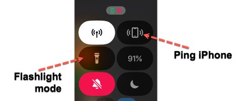
watchOS Control Center. Adrian Kingsley-Hughes/ZDNET
Where did the application selector go?
Now, instead of swiping up, all you have to do is press a button – a simple press on the side button.
But those of you who have been attentive and who have used your Apple Watch may remember that a simple press on the side button made it possible to display the application selector.
So, where did the application selector go?
It has been moved and is now behind a double pressure on the crown. All that remains for us is to teach our brain again to find the things we need in new places.
Source: “ZDNet.com “
